Interactions are the heartbeat of how users navigate and engage with an app’s interface. Whether it’s tapping a button, swiping through screens, or scrolling effortlessly through content, these actions escort the user along their journey.
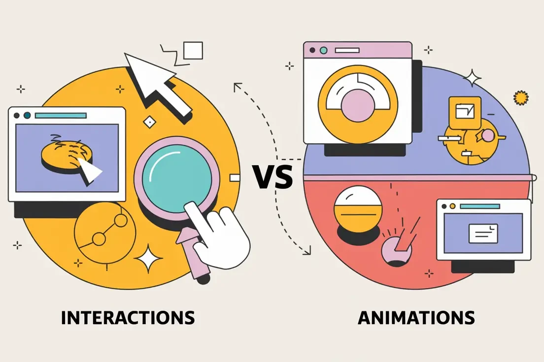
While they often go hand in hand, interactions and animations serve distinct purposes in UX design. Interactions are the deliberate responses to user inputs—think tapping a button, swiping a screen, or dragging an object. They focus on functionality and are designed to help users complete tasks seamlessly and feel more like “part of the product experience”.
Animations, on the other hand, are visual responses to these interactions. They bring life to the interface, providing feedback and guiding users through the app's functionality
Animations can also exist independently of interactions. For example, the Lottie animation below is fun and creative, but since the user cannot engage with it, it’s not considered an interaction. Starting to make sense?
That said, animation plays a major role in interaction design; that’s why it’s such a key part of the interaction discussion. Clear, smooth, and effortless transitions between visual states are key to evoking emotions in users and keeping them visually engaged with your interface.
Animations are visual effects that enhance the experience, like a button smoothly expanding when clicked or a menu sliding into view.
Animations support interactions by providing feedback to the user, guiding attention to complete tasks, and making the experience feel more polished and engaging.
Together, animations and interactions create a harmonious flow within a product, balancing usability with aesthetic appeal.
Effective mobile app design seamlessly integrates both interactions and animations, ensuring that every motion serves a functional purpose rather than just decoration. As you’ll see in the following examples from Bridgette Bryant, well-designed micro-animations (paired with humanized micro-copy) can beautifully reflect a brand’s voice and attitude.
Tools
Figma and Illustrator
Goal
Improve user experience, interaction, and user recall.
Types
Interactive Components
Micro Interactions
On-load Animations
Gesture Reactions
The Big Impact of Little Moments:
Why Micro-interactions Matter
In a world where digital products are released in high numbers, micro-interactions can genuinely provide a competitive edge. They’re the bridge between “functional” and “delightful,” between “forgettable” and “I love this!” So, don’t underestimate the power of these little moments—because when it comes to engaging users, small details create big wins.
These tiny design moments might seem like mere sprinkles on a UX cupcake, but they’re actually the secret sauce that transforms “meh” into “wow.” Here’s why these small touches pack a mighty punch:
1. Engagement That Sticks
Micro-interactions turn a passive scroll into an active experience. Think of that satisfying click ripple, the playful bounce of a button, or the subtle glow confirming you hit the mark. They make the experience feel interactive instead of static—and that’s pure magic for user engagement.
2. Instant Feedback = User Confidence
Ever clicked something and wondered if it worked? Micro-interactions erase that doubt by offering immediate confirmation. From animated loading spinners to progress bars that keep you in the loop, they whisper, “Relax, I got this.”
3. Guiding Without Nagging
Good UX is like a great party—nobody wants a pushy host, but gentle guidance? Perfect. Micro-interactions subtly steer users, showing them where to go or how things work without smacking them over the head with instructions.
4. Building Emotional Connections
Who knew a heart icon filling with color could feel so… human? Micro-interactions tap into our emotions, adding personality to digital experiences. They make us smile, feel acknowledged, and sometimes even form a quirky bond with an app or site.
5. Oops-Proofing
We all make mistakes (or accidentally double tap), and micro-interactions can help users recover gracefully. Subtle nudges can guide users back on track, preventing errors before they lead to full-blown frustration.
Key Components for Designing Micro-interactions
Trigger:
What starts the interaction—either user-initiated (a tap, swipe, click) or system-generated (a notification or alert).
Example: A user taps a “like” button or receives a ping for a new message.
Feedback:
How the system responds to the trigger. This keeps users informed and reassured.
Example: A button changes color when pressed or vibrates subtly for tactile feedback.
Rules:
Define what happens during the interaction and how elements behave as a result.
Example: If a user toggles a switch to “on,” a light icon appears to indicate activation.
Loops & Modes:
These control how long the interaction lasts and whether it repeats or changes over time.
Example: A loading animation looping until data is fully fetched, or a congratulatory animation that plays once when a goal is achieved.
Categories & Types of Micro-interactions with Examples
- System Status Indicators
Help users understand what’s happening in real-time. Examples:- Loading spinners
- Progress bars
- “Saving…” confirmations
- Navigational Aids
Guide users through tasks or indicate transitions between steps. Examples:- Breadcrumb trails
- Swipe indicators
- Animated scroll progress bars
- Interactive Feedback
Reinforce user actions or confirm completion. Examples:- Button hover effects
- Toggle switch animations
- Checkbox ticks
- Error Prevention & Recovery
Help users avoid mistakes and correct them when they occur. Examples:- Password strength meters
- Form field error highlights
- Undo snack bars after a deletion
- Emotional Engagement & Delight
Add personality and enjoyment to the experience. Examples:- Heart animations for “likes”
- Confetti effects when a task is completed
- Playful tooltips or sound effects
- Onboarding & Education
Teach users how to navigate or use features without overwhelming them. Examples:- Step-by-step animations
- Interactive tutorials
- Pulsing highlights on new features
UX Best Practices for Interaction Design
When designing interactions and animations for a mobile app, it’s crucial to strike a balance between functionality and creativity. The best designs are intentional, supporting the user’s journey while reflecting the brand’s personality. Below are some best practices to ensure your designs enhance the experience without overwhelming or distracting users.
1. Don’t Let Micro-Animations Distract Users
Keep the focus on the app’s goals—whether that’s driving conversions or guiding users toward specific actions. Exciting interactions are great, but if they distract users from completing their tasks, they work against you. Design animations that enhance, rather than sidetrack, the user experience.
2. Keep It Clean and Simple
In design, less is often more. Straightforward animations and clear indicators for next steps help users navigate your app without confusion. Overly complex or cluttered animations can dilute your message and overwhelm users.
3. Mimic Real Movements for a Natural Flow
Users have intuitive expectations for how apps should respond to their actions. Swiping, scrolling, and expanding should feel familiar and natural. Design animations that mimic real-world movements to create a seamless and satisfying user flow.
4. Ask: Will This Improve the User Experience?
Each animation should serve a clear purpose. Avoid adding micro-animations just for the sake of it—make sure they enhance functionality or delight the user in meaningful ways. If an animation doesn’t add value, it’s better to leave it out.
By following these best practices, we’ll create a mobile app experiences that will impress users and optimize the value of digital products.


Let’s Collaborate to Solve Your UX Challenges.
“Successful collaboration with cross-functional teams is key! Through effective communication and empathizing with user needs, I translate good ideas into high-quality product designs.”
– Bridgette Bryant