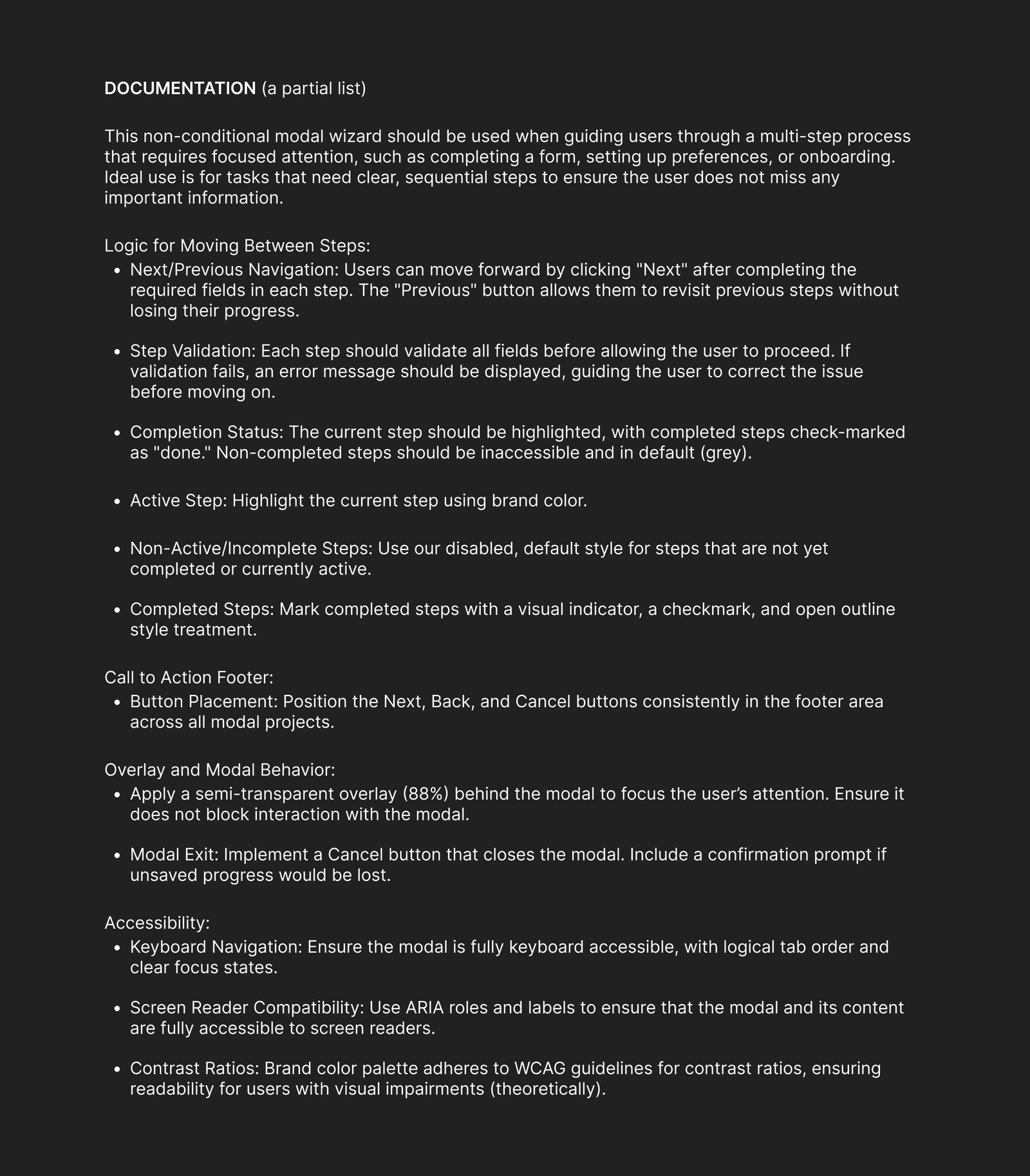
Spec - Modal in Figma
Build a reusable modal wizard component using Figma component properties.
Industry research shows that three-step tour modals achieve a 72% completion rate, making thoughtful modal design critical for user success. My solution established clear navigation patterns, systematized workflows for team consistency, and built expandability for future scalability.

A multi-use stepper modal to streamline complex, multi-step workflows.
Year
2024
Uses
Incident Reporting
Policy Setup
User Feedback
Onboarding
Spec Project
CrowdStrike
Key Goals
Clear Navigation
Systemize for Team
Expand for Scalability
About the Project
CrowdStrike needed a multi-use stepper modal that could streamline complex, multi-step workflows across their cybersecurity platform. The challenge was significant: create one component flexible enough to handle diverse use cases—from incident reporting to policy setup to user onboarding—while maintaining clarity and minimizing cognitive load.
The Design Challenge: Without a standardized approach, teams were creating inconsistent experiences that confused users and slowed development. Modals isolate and highlight specific actions, boosting task completion and controlling user flow for critical actions—but only when designed correctly. My goal was to build a component that would:
- Enable consistency across 50+ designers: Creating a reusable system that maintained brand standards while allowing creative flexibility
- Support scalability: Building workflows that could expand from 3 to 10+ steps without overwhelming users
- Preserve screen real estate: Keeping users on the same page without loading new views, enhancing UX without requiring full-page reload
UX Design Process
Designing an adaptable, user-friendly component that could serve diverse workflows required strategic thinking, stakeholder collaboration, and iterative prototyping. Task success rates are one of the most widely used UX metrics, showing the percentage of participants who successfully complete a task—my design process focused on maximizing this critical measure. Below are the key steps that transformed user pain points into scalable solutions:
1. Research and Requirements
Using existing areas of need across CrowdStrike’s platform, I began with low-fidelity wireframes that focused on layout and flow for real-world use case scenarios: onboarding wizards, surveys, payment flows, and contact forms.
What my research revealed:
- Progress visibility drives completion: Users needed clear progress indicators to reduce confusion and abandonment. Progress indicators, such as numbered steps or progress bars, show users where they are in the process, reassuring them and building confidence as they complete each step Medium
- Flexibility requirements: Workflows ranged dramatically—from simple 3-step forms to complex 10-step configurations—requiring a design that could scale without breaking
- Team adoption challenges: With over 50 UI designers using the system, easy implementation via Figma design system properties was non-negotiable for success
2. Discovery and Concept Exploration
I explored multiple wireframe variations to test critical design decisions that would impact user success:
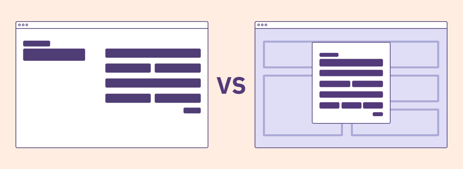
- Vertical vs. horizontal layouts for step indicators: Which orientation would users find most intuitive?
- Action placement and visibility: Where should “Next,” “Back,” and “Save” buttons live to optimize flow?
- Expandable sections: How could we accommodate advanced options without overwhelming users who only needed basic functionality?
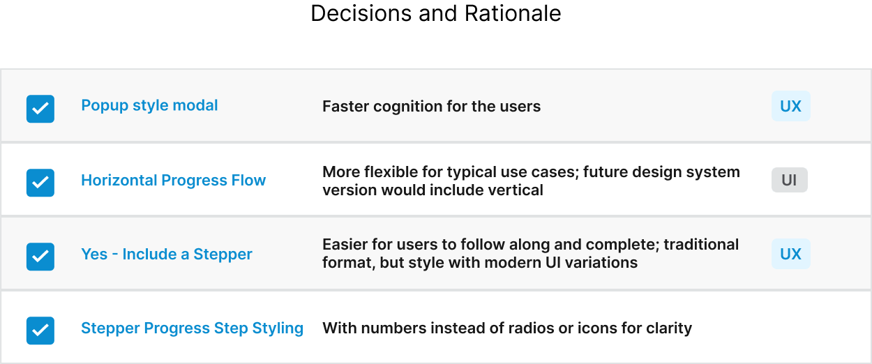
The breakthrough insight: Usability study feedback from a third-party firm guided the decision to pursue a horizontal stepper with overlay panels—a design that balanced simplicity for novice users with power for advanced users. Effective modal design focuses user attention, controls user flow for critical actions, and enhances UX without requiring full-page reloads.
How my design made solutions possible: By testing multiple approaches before committing to high-fidelity design, I avoided costly rework and ensured the final solution would meet diverse user needs across CrowdStrike’s platform.
3. Prototyping and Usability Testing
I developed an interactive prototype in Figma to validate critical assumptions with real users. Testing focused on:
- User comprehension of progress and navigation: Could users understand where they were and how to move forward?
- Responsiveness of collapsible sections: Did expandable areas work intuitively across different workflows?
- Task completion rates: Were users able to successfully complete multi-step processes?
The data-driven approach: Task success rates help designers identify user experience issues, and success rates can be measured as long as tasks have clearly defined goals. By measuring completion rates during testing, I could quantify improvements and demonstrate the value of design decisions to stakeholders.
How my design made solutions possible: The interactive prototype allowed me to fail fast, identify friction points early, and refine the experience before engineering investment—saving time and ensuring the final component would drive user success.
4. High-Fidelity Design and Accessibility
The finalized stepper modal didn’t just look good—it was engineered for inclusivity and scalability. My design featured:
- Expandable/collapsible steps to accommodate advanced settings without cluttering the interface for basic users
- WCAG-compliant accessibility with focus indicators, scalable text, and clear contrasts ensuring all users could navigate successfully
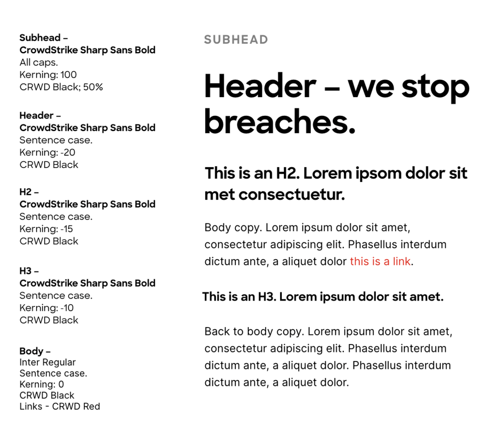
- Consistent UI style aligned with CrowdStrike’s design system, making the component immediately recognizable and trustworthy
The accessibility imperative: Clear feedback on errors at each step is vital to reduce frustration and guide users toward successful completion. My design incorporated real-time validation and accessible error messaging to ensure no user was left behind.
How my design made solutions possible: By building accessibility into the foundation rather than retrofitting it later, I created a component that expanded CrowdStrike’s potential user base while meeting legal compliance standards—a win for both users and the business.
Features Delivered:
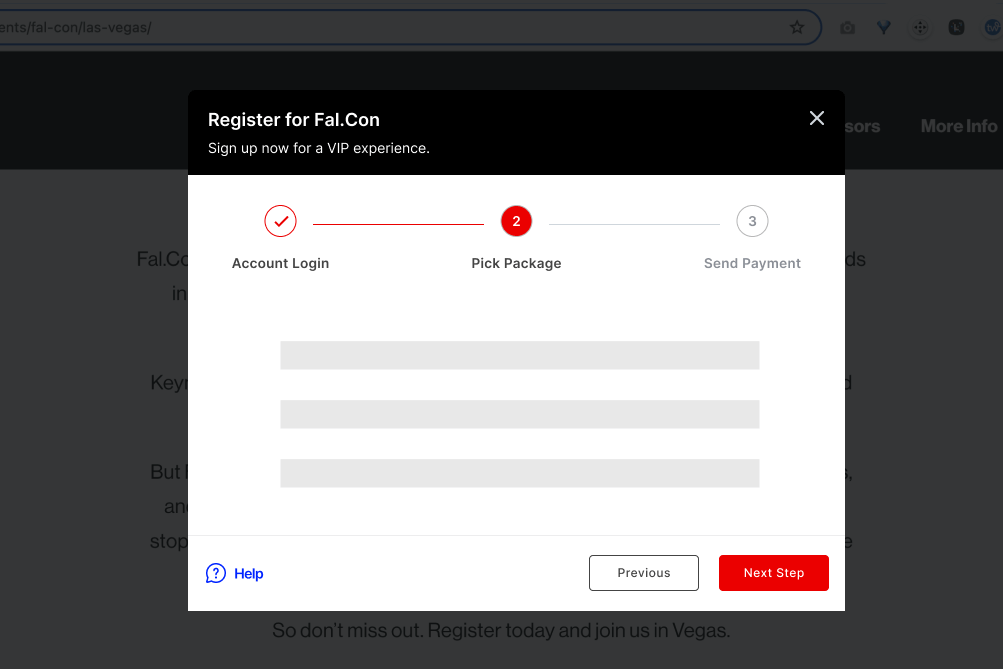
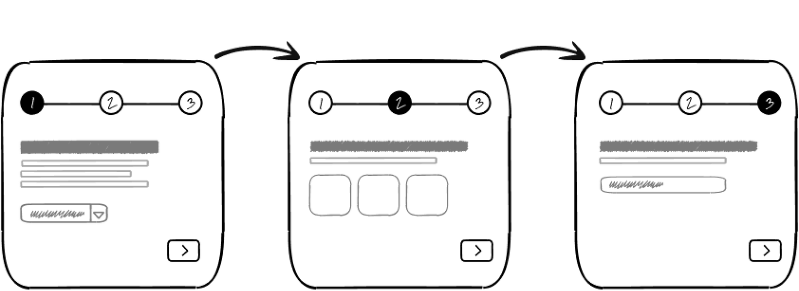
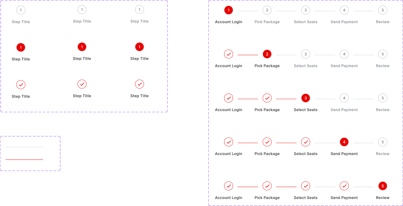
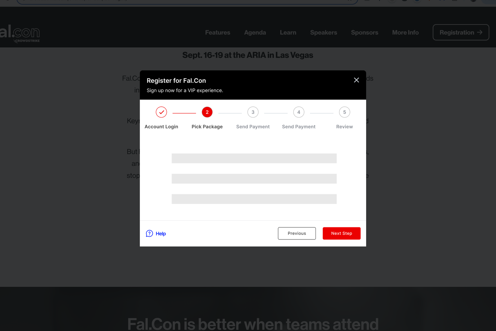
Horizontal Multi-Step Modal
An improved user experience
Problem Statement:
Users often struggled to track their progress in workflows involving multiple steps, leading to frustration and abandonment.
Solution:
My stepper modal design with numbered progress indicators provided clear navigation that reduced cognitive load. By segmenting tasks into smaller steps, users are less likely to feel overwhelmed,
increasing the likelihood of task completion. Users could collapse or expand steps to focus on what mattered most, creating a personalized experience that respected their expertise level.
How my design made solutions possible: The horizontal layout with visible progress created a “breadcrumb trail” effect—users always knew where they were, how far they’d come, and what remained. This transparency transformed intimidating multi-step processes into manageable, confidence-building experiences.
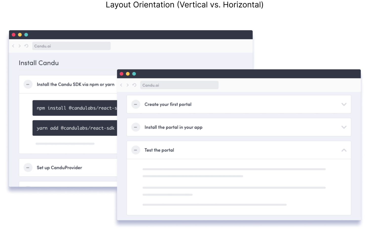
Expandable for Many Uses
Efficient, consistent design system
Problem Statement:
Power users required access to advanced configurations without cluttering the UI for general users. If not designed carefully, wizards can make tasks feel drawn out, leading users to abandon the process.
Solution:
Overlaying sections kept workflows clean and clear while giving users access to the tools and information they needed exactly when they needed them. The collapsible architecture meant novice users saw only essential fields, while advanced users could expand to access granular controls.
How my design made solutions possible: This progressive disclosure approach respected users’ varying skill levels and use cases. A security analyst configuring complex policies got the depth they needed, while a new user completing basic onboarding wasn’t overwhelmed—all from the same component. This flexibility meant CrowdStrike could serve their entire user spectrum with one well-designed system.
Summary
The multi-use stepper modal I designed for CrowdStrike successfully streamlined complex workflows while maintaining the flexibility and scalability that enterprise platforms demand. My user-centered design approach reduced cognitive load, supported diverse user needs from novice to expert, and ensured seamless integration into the existing platform.
Outcomes
- Designed and delivered an expandable, multi-step modal adaptable to various use cases across CrowdStrike’s cybersecurity platform—from incident reporting to policy configuration
- Ensured accessibility compliance, meeting WCAG standards for inclusivity that expanded the potential user base and reduced legal risk
- Collaborated closely with developers, providing comprehensive prototypes, specifications, and interaction guidelines that accelerated implementation and reduced back-and-forth
- Created detailed documentation for engineering and development teams that enabled consistent implementation across 50+ designers, establishing this component as a design system standard
The strategic value: My design didn’t just solve today’s problems—it created a foundation that makes future solutions possible, enabling CrowdStrike to move faster while maintaining quality and consistency.