Case study review on the launch of Move Me, an on-demand mobile app for individuals seeking help with short-distance moves.
Year
2020
Services
UX Research
Data Analysis
Journey Mapping
UI Design
Industry
SaaS Product
Tools
Sketch
Photoshop
InVision
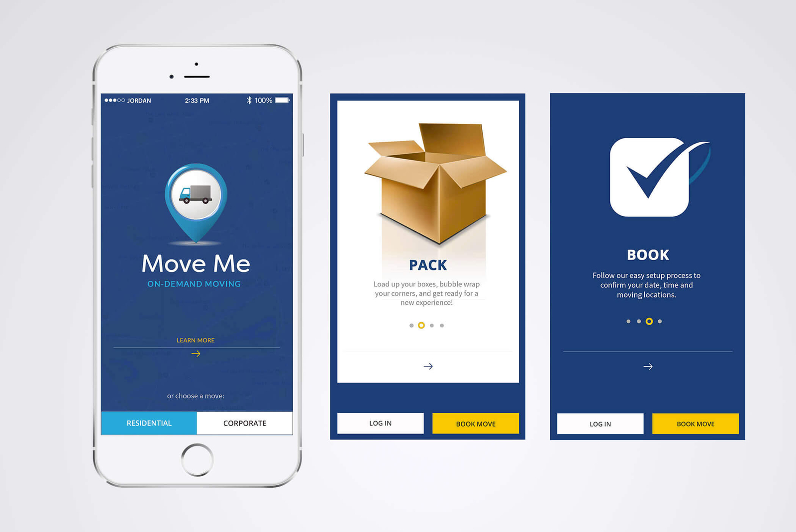
Move Me is an on-demand mobile app designed to assist individuals with short-distance moves. While the industry already had options at the time of this build, Move Me stood out by addressing the common complaints of users who have previously tried other services. Through the introduction of new product features, I was able to effectively resolve user “pain points” and create an improved iteration of a moving service app.
Top 3 User Complaints:
RESOLVING ISSUES
- Security Concerns
- Reliability of Movers
- Cost-Effectiveness
Priorities of the Client:
APP MUST-HAVES
- Share the Vetting Process
- Stress the Saved Time
- Balance Design and Function
Product Challenges
LIMITATIONS
- The Self-Move Option
- Reaching Our Audience
- Getting User Approval
What steps could be taken to meet brand requirements, stand out from competitors, and persuade previously dissatisfied users to give this one another chance?
Approved Strategy and Approach:
- Gain clear understanding of the users’ needs
- Have a thorough competitive analysis
- Use a tried & true formula for successful apps
- Use data to decide how to be position
- Be the better choice, make our app irresistible
UX Hand-Off Deliverables:
- UX Research Report: Profiles market, users, and app design structure.
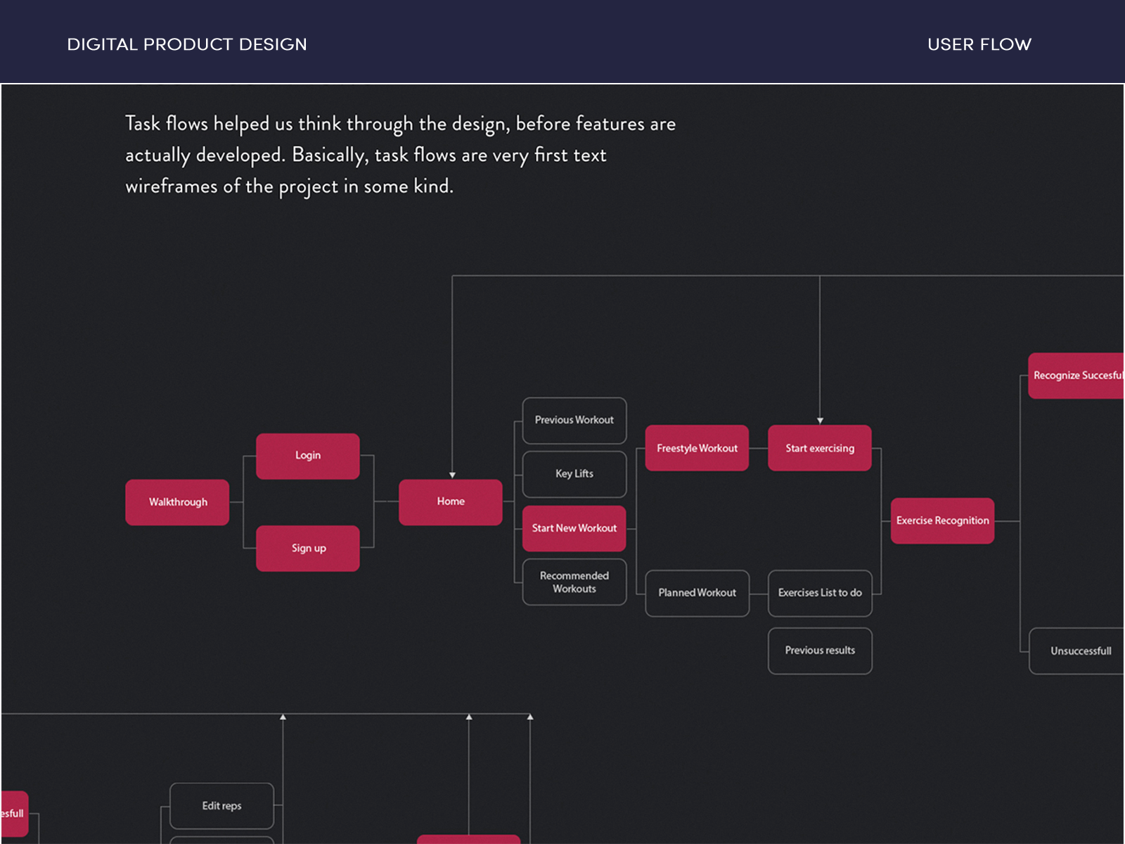
- Sitemap/Journey Map: Visualizes user experience for stakeholders.
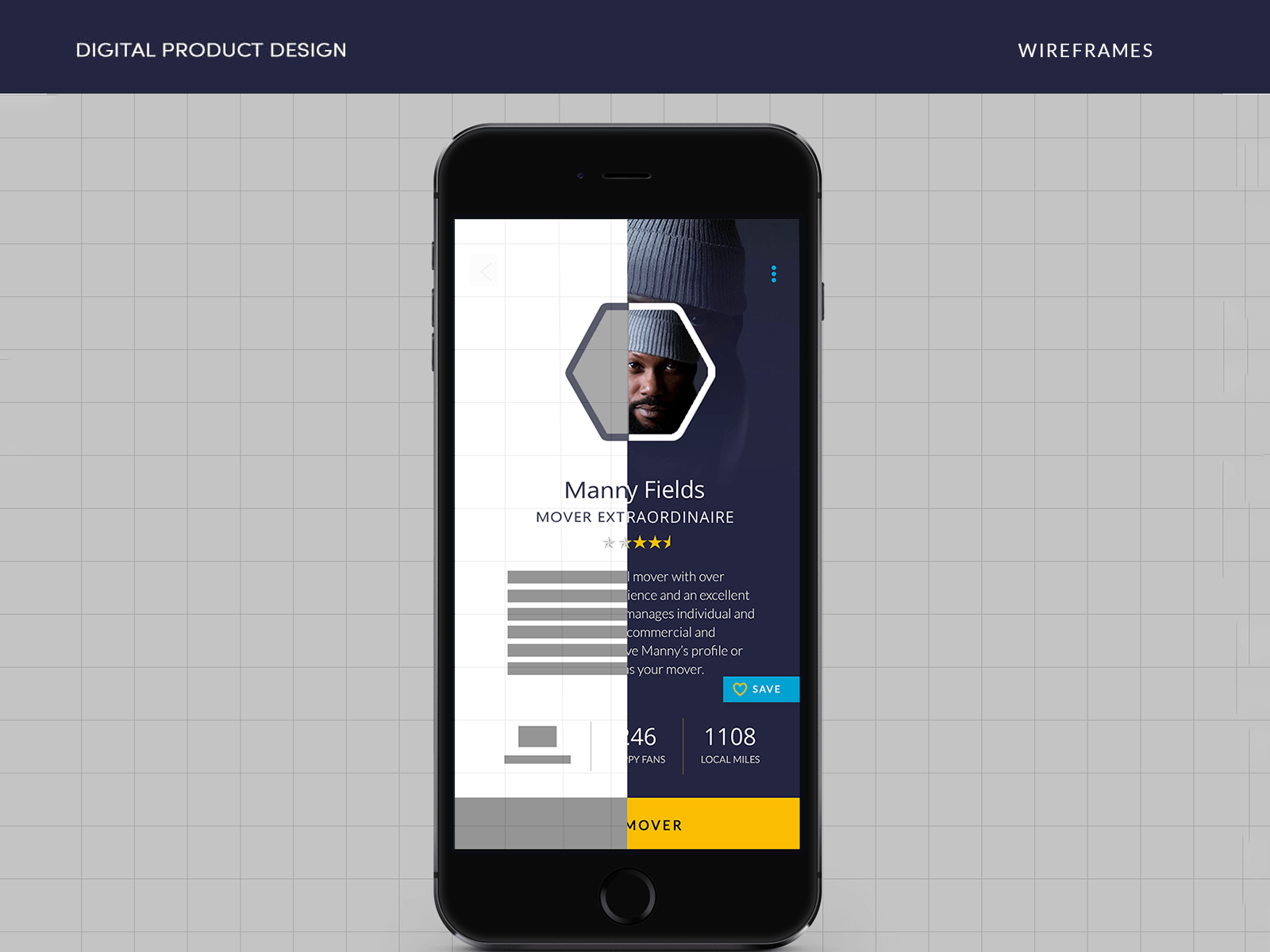
- Sketches/Wireframes: Lo-Fi prototype concepts.
- Logo & Style Guide: For approval by stakeholders.
- Three Feature Enhancements: Improving the idea.
- Hi-Fi UI Design: High-fidelity screens for review.
- Click-Through Prototype: For initial user testing.
Pantone® SAM 1
RGB 6, 76, 122
#064c7a
Pantone® 396 S
RGB 52, 138, 177
#348ab1
Pantone® 1396 S
R63 G61 B62 A1
#3f3d3e
Pantone® 693 S
R243 G201 B54 A1
#f3c936
Purpose and Planning
STAGE ONE
We begin every project with the goal of absorbing the mind of my client and getting to know their initial target audience.
- The Benefits of Starting with a Mind-Meld:
- No guessing – decisions are deliberate and productive
- A product that users can more easily connect with
- Ultimately, a better chance for success
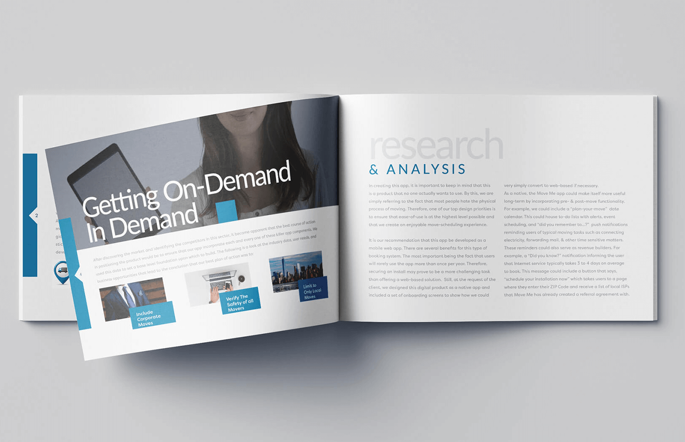
At the conclusion of this stage, a drafted creative brief is now ready for approval. This creative brief is based on a user experience research report summarizing findings from the discovery stage. In this stage, the professional carried out various customer journey optimization techniques, including:
- Qualitative Research
- Experience Map Drafting
- Competitor Research
- User Storyboard
User experience (UX) research strategies encompass a wide range of methods, from focus groups and content audits to surveys and more.
In this case, the development of persona profiles and in-depth market research were employed to identify the path of greatest impact and identify potentially profitable feature enhancements for the app. With this information, we now had an accurate overview of the app’s primary users.
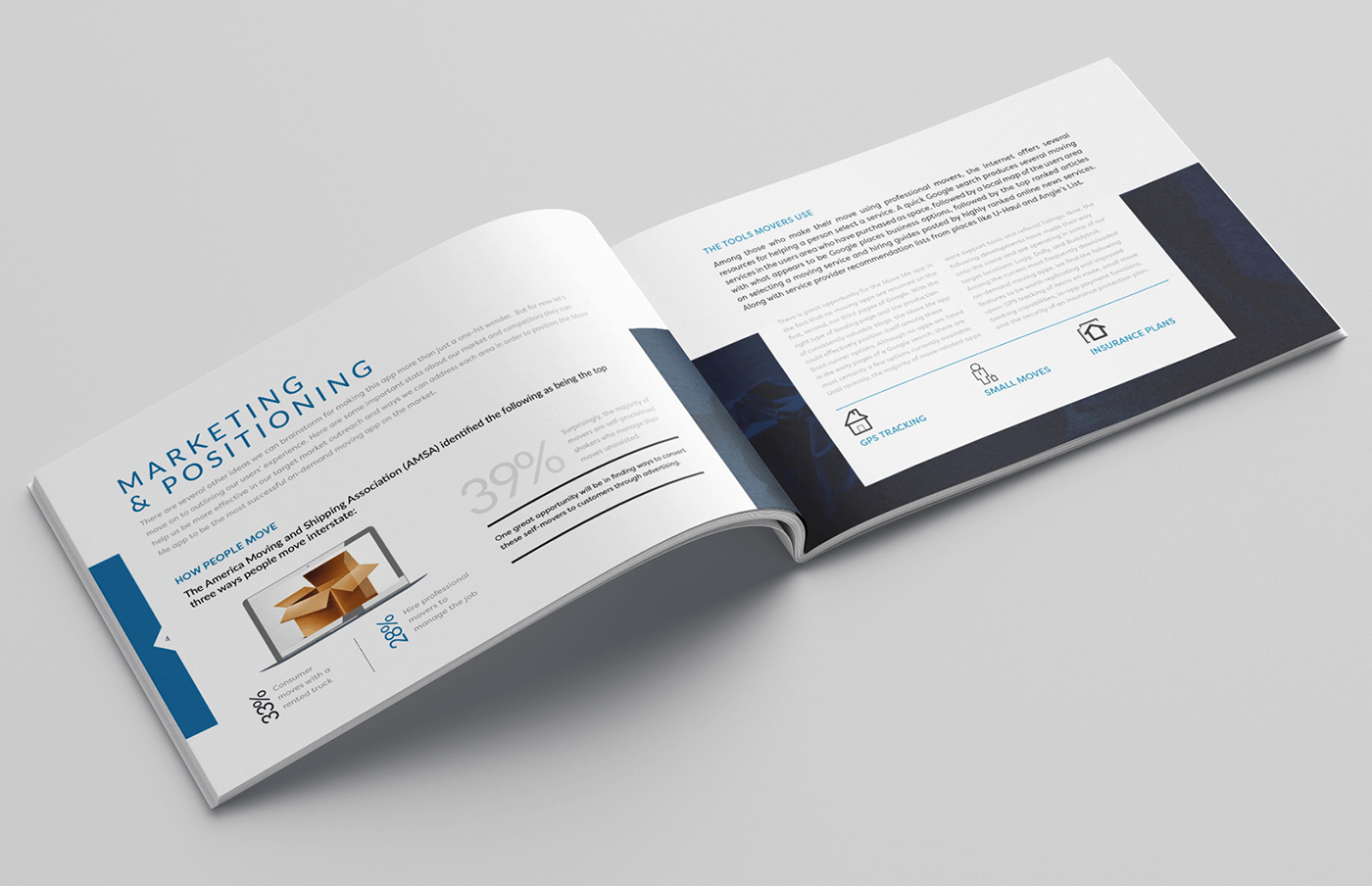
The resulting research report is a valuable deliverable that consistently demonstrates its worth throughout the lifespan of the product and across the organization. Once distributed, it efficiently informs team members and stakeholders about crucial insights regarding the market, competitors, decisions related to the brand’s visual identity, and long-term business objectives.
This report not only clarifies the decision-making process but also outlines the strategic approach for establishing a strong market presence and launching the product most effectively and efficiently.
Delighting Users
STAGE TWO
The data was analyzed and delivered as “user personas.” These personas assist individuals involved in the product’s design in quickly becoming acquainted with those who should be at the forefront of the development process.
Personas aid in viewing product design from the user’s perspective, enhancing familiarity with their emotional, social, and psychological attributes.
Going for the Win
We can resolve user issues by gaining insights into what users truly considered problematic. This knowledge facilitated the positioning of the product and the crafting of its brand identity and content strategy.
With an improved understanding of users, the professional was better equipped to design a superior product. This profound insight allowed for the meticulous design of user interactions, with every click strategically handcrafted based on user preferences. The utilization of UX research acted as a crystal ball, enabling:
- Evaluation of buying habits and user tendencies
- Discovery of user preferences for connecting with the world around them
- A/B testing of messaging strategies that typically resonate with them
- Understanding the most effective ways to communicate with them
- Developing an intimate understanding of their personal values and priorities
Possessing such in-depth knowledge of the user makes product design decisions more intuitive and helps us significantly increase the likelihood of user satisfaction.
Framing the Experience
STAGE THREE
During this stage, the professional ensures that every research-derived issue which can be addressed is optimized.
Throughout the sketching and wireframing phase, she consistently refers back to the user personas, ensuring that each line drawn serves the purpose of meeting user needs. Information collected during the initial discovery phase also guides the process to ensure that the product aligns with business objectives.
Now, the vision begins to materialize!
Getting The Look - UI
STAGE FOUR
After conducting initial user testing and receiving feedback from team members and stakeholders using the wireframes as a low-fidelity prototype, it is time to make improvements by establishing the visual design elements of the brand and creating a testable version of the app.
Visual Design Guidelines
The creation of a design system for the new product is a pivotal step, serving as the cohesive foundation for the brand. Therefore, prior to developing high-fidelity UI designs, the next essential step involves crafting a brand style guide. This guide defines the visual elements to be used across all design materials and requires approval from stakeholders.
The approved brand style guide is outlined in the research report, setting forth guidelines that establish the brand’s message and define the tone and personality, including the approach to users with content.
Before the product launch, it is imperative to ensure that all design and initial testing efforts align perfectly. At this juncture, a thorough review of the executed process and current results is conducted to eliminate any extraneous elements and ensure a user-friendly, familiar experience.
This stage marks the moment to step back and meticulously review the crafted user experience.
