YouTube LivingRoom/Smart TVAudit
The ChallengeYouTube’s big-screen (TV) experience has become one of its most unexpectedly popular use cases. However, the current design still reflects a mobile-first mindset — with interaction patterns, navigation depth, and feature behaviors that don’t fully align with a lean-back, shared, living-room viewing experience.
The OpportunityHow might we evolve YouTube’s Smart TV interface to better serve this growing audience? The goal is to reduce friction, enhance discoverability, and create a more immersive experience that feels purpose-built for television — not merely adapted from mobile.
YouTube Living Room (SMART TV APP) UX Redesign Audit
Date: Autumn 2025
IntroThe YouTube Big Screen app has been central to how users experience video in their living rooms, but its earlier versions carried UX challenges that limited engagement and multitasking. With the latest redesign, YouTube began addressing these friction points through a more modern interface, streamlined controls, and layouts that improve discoverability without disrupting playback.
ObjectiveBy analyzing user feedback and recent experimental UI changes, we can highlight design improvements that drive engagement and clarity. With this data I will create suggested actions the developers and designers of YouTube for smart TVs can use to potentially help bring the app and in of its viewpoints into a consistent and lovable state.
Media Facts Overview:Wondering why some people opt for the Smart TV experience versus traditional mobile? Aside from background "noise" while cooking, housecleaning, or working, the Living Room experience gives way to an easier technical viewing experience that, after extended periods of time, may actually be better on the viewers health in terms of eye care and hearing (limited ear buds time). Here are some other key factors:
Experience Overview: What’s working
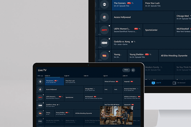
1. Material Design 3 RefreshCleaner, modern look with translucent overlays and capsule-shaped buttons.Buttons feel more refined, less intrusive, and easier to identify against video content. 2. Less Intrusive Player ControlsPlayback controls no longer dominate the screen.Relocated volume control to the bottom-right improves visibility and avoids overlap with other UI elements. 3. Dual-Column Layout for Smart TVs- Supporting information (descriptions, comments, product links) is now displayed beside the video.- Reduces interruptions by keeping video visible while exploring details.- Enables “lean-back multitasking” — watch and browse at the same time. 4. Enhanced MultitaskingComments and product links can be read without pausing video.Creates a more immersive and uninterrupted flow for viewers. 5. Vertical Slider ControlMore intuitive than a horizontal bar for volume and other adjustments.Suggests scalability for future TV remote or voice-driven adaptations. Another feature that recently appeared in my personal experience was dynamic headings in the browse screen’s “shelves” view. It seems to take a user’s previous filter selection and automatically generate a row of suggested videos from that category. I first noticed it a few weeks ago when a new carousel row titled “Over 20 Minutes” appeared a day or two after I had selected that filter on mobile. Depending on perspective, it’s either neat and helpful — or a little creepy. 🙂
Room for ImprovementAs YouTube turns 20, it’s a perfect moment to celebrate both its legacy and its future. The platform has grown from a place to watch simple clips into a multi-format ecosystem that spans Shorts, podcasts, live streams, and the living-room experience. This anniversary redesign was part of that growth, and while it introduced meaningful improvements, there are still areas where refinement can make the smart TV experience more intuitive, more enjoyable, and more in line with how people engage with video today.
UX Research (a condensed look)
Context & Introductory Summary
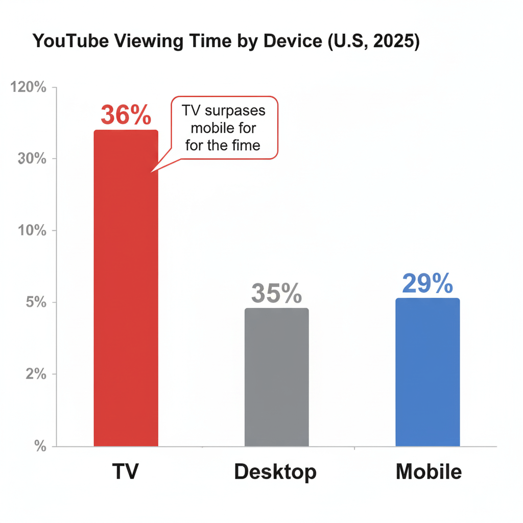
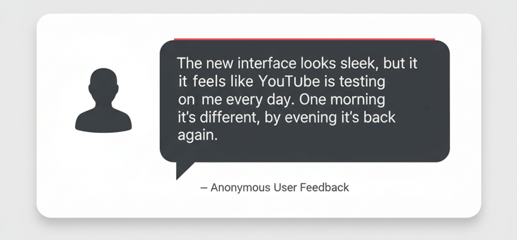
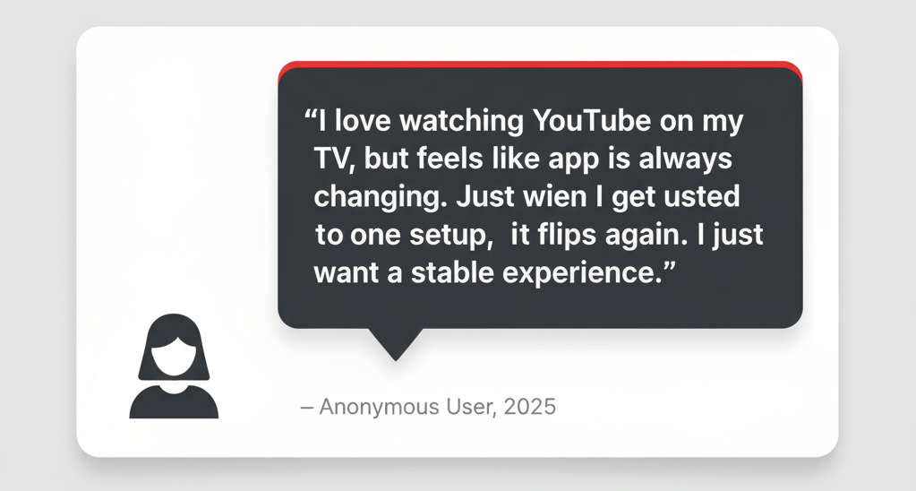
Earlier this year, YouTube made public that TV-viewing has overtaken mobile for total watch time in the U.S. This has pressed YouTube to commit more fully to its Big Screen experience. Ahead of a larger overhaul expected later this year, YouTube has rolled out several UI tweaks: small but meaningful changes to help people find favorite creators, shows, podcasts, music, and other content more quickly on smart TVs and gaming consoles. These tweaks are meant to reduce friction in the somewhat outdated TV app and simplify navigation. At the same time, there are growing frustrations. As of September 2025, the current UI updates often feel distracting from the core video-watching experience on YouTube. Frequent interface changes, ongoing live-testing of new features, and updates rolled out directly in the live app have left some users feeling that the experience is unstable. After decades as a leading platform, if YouTube still struggles to deliver a consistently solid Big Screen UX, it raises questions about how well its design and development process is adapted to the unique demands of television as a delivery medium.
User Feedback Summary
YouTube’s redesigned web player sparked strong reactions when it first launched. Early iterations stripped away familiar controls, leaving loyal users frustrated and vocal about the loss. But instead of ignoring the backlash, YouTube listened. The updated version restores key features people depend on — like mouse scroll volume control and clickable timestamps — while layering in fresh touches that genuinely improve the experience, such as a refined theater mode with a smart, downward-facing arrow to reveal the “more videos” panel.
The April 2025 test introduced a bold Material Design refresh with sleek, pill-shaped controls, but by pulling back too much, it overlooked the habits and workflows that anchor user satisfaction. The most recent changes show progress: a product that not only looks modern, but also respects the way people actually use it.
Defining the Problem – Concluded
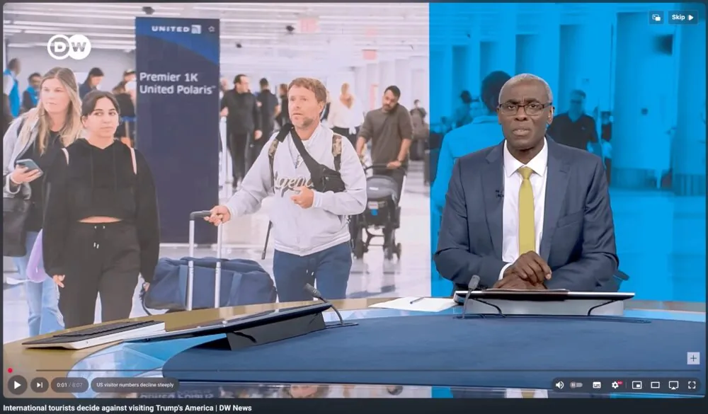
The video clip below summarizes one of the biggest issues in this redesign saga has been the constant on-and-off switch flipped by developers. A user might open YouTube to one version in the morning, encounter a different version by the afternoon, and then see the original interface again that evening. This kind of unintentional fluidity creates uncertainty, and inconsistency is not something digital platforms should aspire to, and for fans of the app, it's just a little confusing and saddening.
Now let's switch into solutions mode. In the following UX redesign audit, we will explore ways the current flow and feature interactivity can be restructured and enhanced to improve the video-play experience and restore user confidence while deepening long-term engagement with the platform.
UX Audit - Design Recommendations
These changes highlight key opportunities to further refine the YouTube’s Smart TV experience and create an even more seamless, enjoyable environment for viewers.
Part 1: Setting the Stage Unique Parameters for Big Screen
Designing for YouTube on the big screen isn’t just a scaled-up version of the mobile experience — it’s a fundamentally different environment with unique opportunities and challenges. Unlike mobile, where interactions are quick, personal, and often on-the-go, the television experience is lean-back, shared, and focused. Users engage from a distance, with limited input methods (usually a remote), and expect a consistent, low-effort flow.
User Empathy and Accessibility Considerations
- Content Expectations: Viewers on TV typically arrive looking for long-form, immersive content. Shorts may dominate mobile discovery, but on the big screen, references to them should be minimal to avoid disrupting user intent.
- Muscle Memory & Effort: On mobile, habits form quickly and changes can be adapted to with ease. On TV, however, each action requires more physical and cognitive effort — scrolling with a remote, clicking multiple times to find controls. Because of this, frequent UI changes are disruptive, and testing new designs “live” risks eroding trust. Consistency is key.
- Legibility Isn’t Only About Size: Contrary to assumption, larger text does not always improve readability. Placement, contrast, and overlay treatments matter more. For example, in one redesign feature, moving title, date, and viewer data to the top-left without an overlay actually decreased scannability, as the information blends into the background rather than standing out.
Benefits Unique to the Big Screen Medium
- Longer Watch Times: Viewers tend to stay engaged for longer sessions, creating opportunities to surface playlists, channels, and extended content journeys.
- Lower Distraction Levels: Unlike mobile, where notifications and multitasking compete for attention, the TV context allows for deeper immersion and sustained engagement.
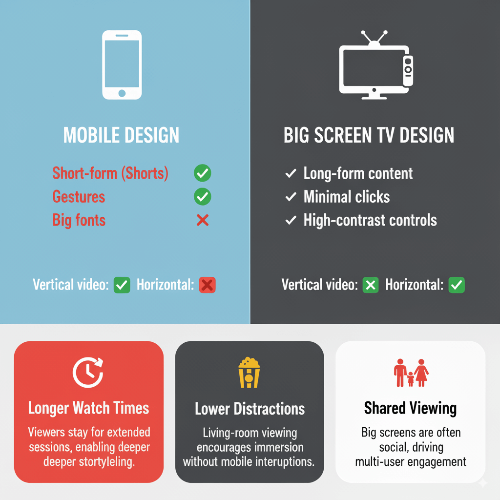
Mobile vs. Big Screen: Dos and Don’ts
While the two platforms share some foundational UX principles, their contexts, inputs, and user expectations are fundamentally different. The table below contrasts mobile and Big Screen parameters, outlining what works well on each and what pitfalls to avoid when translating YouTube’s experience from the palm of the hand to the living-room screen.
Design Area Mobile – Do Big Screen – Do Big Screen – Don’t Content Priorities Highlight Shorts, trending clips, and snackable content for quick discovery. Emphasize long-form, immersive videos, playlists, and channels for lean-back viewing. Don’t push Shorts prominently — TV viewers aren’t coming here for snackable content. Interaction & Effort Assume touch gestures and fast swiping; frequent UI updates are tolerated. Keep navigation minimal; remote clicks and scrolls are effortful, so consistency is essential. Don’t introduce frequent live UI changes that disrupt muscle memory. Readability & Layout Larger font size helps on small screens; overlays provide focus. Use strong contrast and smart placement; overlays may help text stand out against video backgrounds. Don’t assume “bigger text” automatically solves readability at 10–12 ft viewing distance. Engagement Context Expect multitasking, short watch times, and notification interruptions. Expect longer watch sessions, higher focus, and shared household use. Don’t overload users with too many competing UI elements or distracting side panels. Search & Discovery Predictive search, autocomplete, and personalized recommendations dominate. Prioritize voice search, predictive shortcuts, and simplified browse categories. Don’t rely on complex typing or nested menus — remotes make that painful. Control Visibility Keep controls subtle but easily accessible; smaller touch targets work fine. Ensure high-contrast, visible controls (e.g., pill-shaped frosted buttons) without blocking content. Don’t bury controls or reduce contrast — users need clarity at a distance.
Part 2: Improving the UX - Ideas for Product Design
1. Stabilize the User Interface
- End the cycle of frequent, unannounced live A/B tests on TV.
- Implement longer test periods with controlled cohorts to avoid users experiencing multiple UI versions in a single day.
- Shift from constant live-testing on Smart TVs to staged rollouts with clear communication and feedback loops.
- Benefit: Builds user trust in the platform’s reliability and enhances YouTube’s brand equity in a high-visibility environment where households share the experience.
2. Refine Readability Standards for TV Distance
- Establish a 10–12 ft viewing distance guideline for text, buttons, and overlays.
- Increase contrast between UI elements and video backgrounds to reduce visual strain.
- Benefit: Improves accessibility and usability across diverse households.
3. Reduce Remote Interaction Cost
- Map intuitive remote shortcuts to mirror mobile gestures (e.g., double-tap → 10-second skip, long press → open menu).
- Add “quick jump” navigation for common actions (Subscriptions, Watch Later, Playlists).
- Benefit: Streamlines lean-back navigation and minimizes friction.
4. Clarify Information Hierarchy in Side Panels
- Introduce collapsible or tabbed layouts for comments, descriptions, and product links.
- Use visual hierarchy (weight, contrast, placement) to guide attention.
- Benefit: Reduces cognitive load while encouraging deeper exploration.
5. Optimize Search for TV Context
- Enhance voice search accuracy and response speed.
- Introduce predictive shortcuts (e.g., “Continue last watched series,” “New from subscribed channels”).
- On-Screen Search Simplicity – searching with a remote is often frustrating. Improvements to predictive text, voice integration, or personalized shortcuts can drastically improve usability.
6. Other Opportunities
- Control Contrast & Visibility – the April redesign introduced pill-shaped, dark-frosted buttons on desktop, which sparked debate. But for the big screen, that level of sleek contrast could be exactly what’s needed to keep controls visible without overwhelming the video experience.
- Explore ad formats and commerce integrations tailored for longer sessions and shared screens (e.g., interactive ads controlled via remote, shoppable video experiences).
Part 3: From Concept to Implementation
Action - the great distinguisher of success. These recommendations are framed as next-stage deliverables for design engineers to execute. Each Epic outlines a focused area of improvement, supported by clear user stories and concrete tasks. Together, these items provide a structured pathway for addressing current usability gaps, strengthening design consistency, and elevating the overall YouTube Living Room experience. First, a few quick adjustments that can be made to stabilize the experience right away.
Fast Fixes
1. Strengthen Readability at DistanceIncrease text contrast against translucent backgrounds and test all typography against the 10–12 ft “living room readability standard.” 2. Streamline Remote InteractionsReduce the number of clicks for common tasks (e.g., add “skip row” navigation, quick access to Subscriptions and Playlists). 3. Add Lightweight Onboarding Prompts to Help Users NavigateSurface simple, contextual microcopy (e.g., “Press right to see comments without pausing”).
Design Epics
Epic 1: Improve Readability & Accessibility on Big Screen
Story: As a viewer, I want text and metadata to be legible from a 10–12 ft distance so I can easily scan information while watching on TV.
Task 1.1: Audit all current font sizes, weights, and placements against 10–12 ft readability standards.Task 1.2: Increase contrast ratios on translucent overlays for video titles, dates, and metadata.Task 1.3: Create before/after mockups demonstrating improved legibility.
Epic 2: Streamline Remote Interaction Flows
Story: As a lean-back user, I want to complete actions with fewer clicks so I don’t feel frustrated navigating with a remote.
Task 2.1: Map current D-pad click paths for common actions (Playlists, Subscriptions, Watch Later).Task 2.2: Implement “skip row” navigation shortcut for faster browsing.Task 2.3: Prototype and test “quick access panel” for high-frequency actions.Task 2.4: Deliver animated prototype of optimized interaction path.
Epic 3: Add Contextual Feature Onboarding
Story: As a viewer, I want unobtrusive hints so I can discover new features without tutorials disrupting playback.
Task 3.1: Design microcopy prompts (e.g., “Press right to see comments without pausing”).Task 3.2: Build logic to trigger prompts only once per feature or until dismissed.Task 3.3: Conduct A/B test to measure adoption and retention of features with onboarding vs. without.
Epic 4: Translate Mobile Gestures to Remote Controls
Story: As a multi-device user, I want familiar navigation patterns so I don’t need to relearn controls across platforms.
Task 4.1: Define remote equivalents for mobile gestures (double-tap = 10-sec skip, long press = options menu).Task 4.2: Implement gesture equivalents across all Smart TV platforms.Task 4.3: QA test to ensure parity of feature performance across devices.
Epic 5: Restructure Side Panel Information Hierarchy
Story: As a viewer, I want comments, descriptions, and product links to feel organized so I can browse without distraction.
Task 5.1: Redesign dual-column layout into collapsible or tabbed structure.Task 5.2: Annotate wireframes with hierarchy rules (priority order, collapse states).Task 5.3: Conduct usability testing with side-panel prototypes to validate clarity.
Epic 6: Apply Material Design 3 Consistently
Story: As a viewer, I want a clean and consistent interface so I can focus on the content, not the controls.
Task 6.1: Audit all controls against Material Design 3 guidelines.Task 6.2: Standardize pill-shaped, frosted controls across the Big Screen app.Task 6.3: Deliver updated component library for engineering handoff.
Release Outcomes — Positioned as backlog-ready, these Epics enable engineering and product teams to layer in KPIs and metrics that track success and keep everyone aligned toward a shared goal. At the business level, the key measures are clear: reduce time-to-play, lower interaction cost, drive feature adoption, ensure readability, maintain cross-device consistency, and improve overall user satisfaction. Collectively, these KPIs reflect the core drivers of usability, adoption, and customer loyalty for YouTube’s Big Screen TV experience.
Conclusion
We Always Continually Improve
I love YouTube. I watch it for at least eight hours a day — I don’t have a problem; I can quit anytime. But as a digital product designer who uses the app across all four aspect ratios and two mobile operating systems, I can clearly see a gap in cross-platform collaboration.
Bringing all teams together to work on updates before release could help create a more consistent and predictable experience for users, making future upgrades less disruptive. There are also some features — such as the dark frosted pill — that may not have worked well in one medium but could perform great in another. By sharing ideas and collaborating during design planning, YouTube teams can truly make the most of their creativity and genius.
But as you know, I’ll be watching either way. Thanks for exploring the options with me.
Supplemental sources: